Paradox of Choice- 150 Million Pizzas
Let’s talk about those gosh-darn millennials and their crazy demands...
Millennials do, in fact, demand a lot from companies. From the products you sell to the causes you represent to the design and functionality of your website. The digital world has unlocked so many options for consumers that they no longer have to settle for anything short of their ideal product in their ideal scenario.
In other words, if I want to look at the menu for your food truck on my mobile phone at 8am, and I want that menu to include allergy labeling, your website better meet those needs. And it had better meet those needs instantly and in an easy to navigate, mobile friendly way. If not, my cliche millennial lack of patience means I’ll find another food truck.
And with these increasing consumer demands, we expect companies, and more specifically websites, to provide more choices than ever. Marketers are constantly told that millennials want control. That millennials want to customize.
But perhaps that’s not always the case. Take for example the thing I do way too often; order pizza.
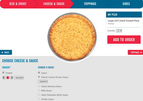
Dominoes offers 5 basic styles of pizza on their website. If you pick Hand Tossed, for example, you then select 1 of 4 sizes and then 1 of 3 crust choices. You can also open the drop down for special instructions to choose between two baking styles, 2 crust seasoning styles, and 3 pizza cutting choices. Now we’re on to cheese and sauce. If you want cheese, you can choose one of five options for “cheese volume”, and you can make this choice twice, once for each half of the pizza. For sauce, there are 5 different choices, and for each type of sauce, you can choose light, normal, or extra. And don’t forget toppings. We have 8 meat choices and 16 non-meat choices. Oh, and in case you were wondering. For each individual topping you choose you have four density choices (light, normal, extra, or double), and again, of course, you can make separate choices for each half of the pizza. Allow me to editorialize for a moment here and just say that I love the idea of choosing the “density of pepperoni” on my pizza.
In case you’re wondering, if you plan to order a two-topping pizza from Dominoes, you have roughly 149,040,000 possible combinations… Yup. 149,040,000…
To be honest, Domino’s is one of my all time favorite marketers, and I’ll explain why in another post. And I’m not here to tell you that Domino’s website is poorly constructed. But it is quite easy to understand how someone might visit this website and leave halfway through the purchase funnel feeling overwhelmed and intimidated.
So how do we give millennials the choice and customization they demand while not overwhelming them?
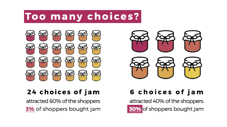
There is a famous consumer behavior study by a women named Sheena Iyengar that helps us visualize this concept. I’ll give you the high level overview, but here’s an excellent video of the famous researcher explaining her work in a lecture at Columbia. Sheena basically found that when given the choice, most grocery shoppers preferred to shop for jam at a display that contained dozens of jam varieties. However, the shoppers that went to this display were dramatically less likely to make an actual purchase as compared to the shoppers at a display with only a few jam choices.
As consumers, we crave choice. Or at least, we think we do. The idea of 150 million pizza choices sounds appealing. But in the moment, many of us find that we actually need a little tighter guide rails.
The key is to present the illusion of choice or the option of choice to your website visitors. Take this screenshot from St. Jude’s donation page as an example.
In reality, the donor has infinite choices, as indicated by the grey box marked “other.” However, by avoiding the presence of an empty fill-in-the-blank box, we make things easier on the consumer who is intimidated by choice. Similarly, the $100 box is actually pre-selected when you arrive on the page. It couldn’t be easier to select a different amount, but it gives consumers the option of not having to pick an option.
Choice is a powerful and scary weapon that you wield as as a marketer or website designer. Think long and hard about how to leverage it to give consumers both what they want and what they need.
Interested in more stories like this? Check out SteveLerch.com to learn more about Steve’s keynote speeches and contact Steve about working with your team, company, or event.


